Introduction
Ticket sellers like Live Nation took a huge hit during the pandemic. With no one going to concerts, musicians started hosting live streamed concerts sites like Instagram. Our assignment was to propose a streaming platform to complement Live Nation's live concert business.
Tools
Figma, Photoshop, Miro, teamwork
Takeaways
Go in nervous, and put it out there. Hold space for yourself and for your teammates. Hold space for fear, dread, doubt, insights, joy, laughter, failure, success… I don’t imagine there was ever a great project born without all of these and more.
Roles
For this team project, I was responsible for Information Architecture, Sketching, Interaction Design, and Prototyping.
Video walkthrough of prototype
[ no audio ]
User Research / How Users Prefer to Rock
The information gathered in our user interviews indicated that concert goers who felt isolated when watching streaming music events. More than any other part of the live concert experience, the thing they missed was being with their friends.
We asked ourselves, HOW MIGHT WE provide a virtual concert experience that gives allows concert-streamers to hear the music they love in the virtual company of their friends?
Enable purchasers to reserve a pre-show virtual room, similar to zoom, that would allow viewers to hang out with their friends before these show, and to remain on video and chat during the show.
Information Architecture
Our project had two interfaces: one for the purchase flow, and a second for the streaming experience. The distinctions are shown in the user flow and site map below.
Early Planning and Sketches
As we iterated through this project, the ticket flow required the most significant revisions. I will use the reservation screen from the ticket flow to illustrate how we incorporated design principles and, later, user feedback to improve this screen and the workflow.
In our earliest round of sketches, the reservation page had to accomplish all of these goals:
1. Reserve a qty of tickets.
2. Reserve a video lounge to gather before the event
3. Collect information (emails) for the invitees
4. Define preferred method of contact
5. Enter purchase information
2. Reserve a video lounge to gather before the event
3. Collect information (emails) for the invitees
4. Define preferred method of contact
5. Enter purchase information
Oh, and it was also going to include a pitch for merch along the way.
Even for mobile scrolling this was too much. We realized we were going to have to break this up.
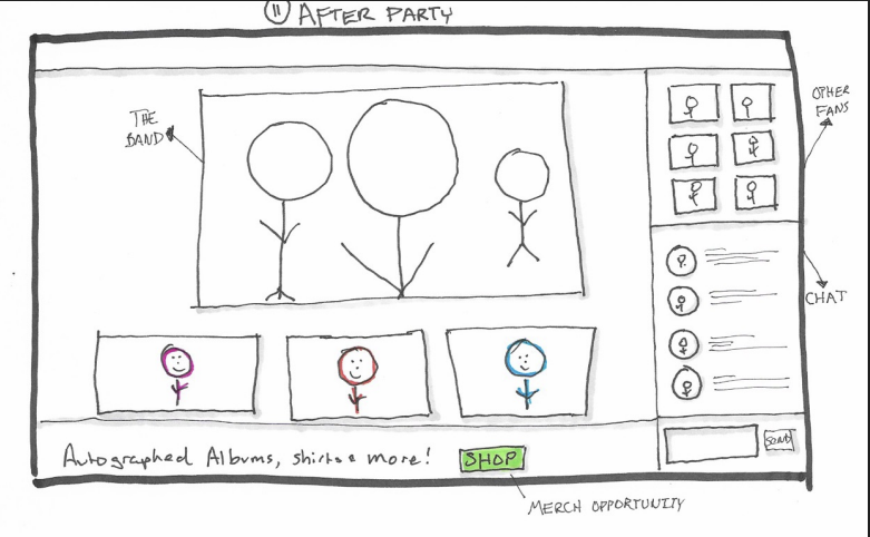
Sketches for the ticket flow and the streaming platform
In the bottom left panel shows a "ticker tape" of video streams of all of the audiences watching. The concept was to re-introduce the variety and randomness of people you see at a concert. However, the platform doesn't carry the policing a live venue offers; the concept was scrapped for security reasons.


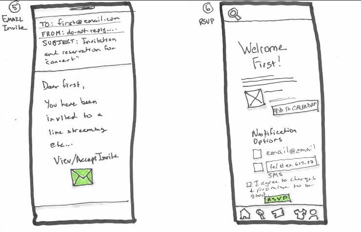
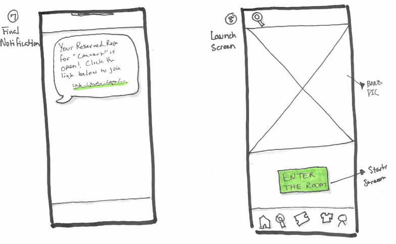
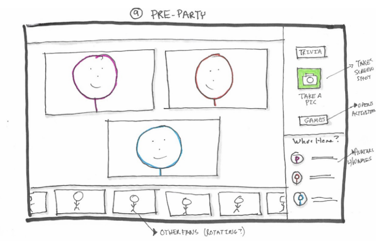
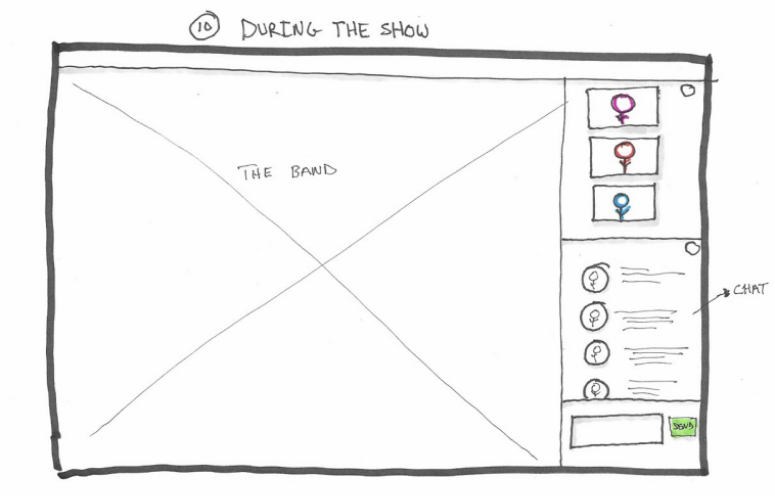
Mid Fidelity - WIREFRAMES
The wireframes laid bare the layout and navigation issues on our reservations
The first version of our reservation page had 5 goals.
In the wireframe we reduced this two. Then we added another to bring us back up to three. We should have stopped at two.
1. Reserve a qty of tickets.
2. Reserve a video lounge to gather before the event
3. Add VIP Access to your purchase.
2. Reserve a video lounge to gather before the event
3. Add VIP Access to your purchase.
Usability testing would later point out two flaws in this design
Users were unclear of the cost for the Pre-show Room and VIP Access cost, and were hesitant to check the box.
Users also said they didn't know what the Virtual Pre-show Room the VIP Access are, because there wasn't a description. As it turned out, we didn't know either. The VIP Access wouldn't make it to the final round.
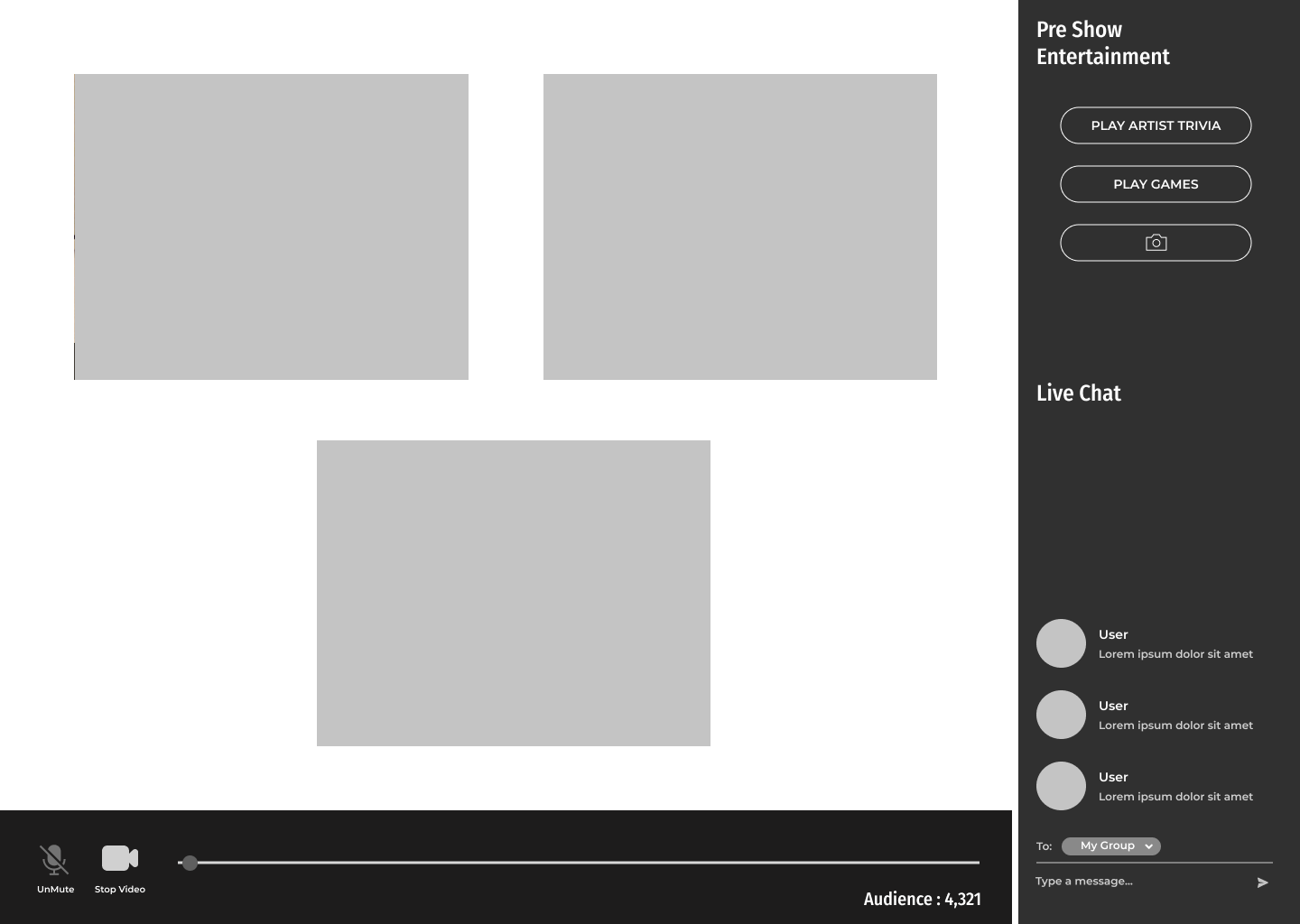
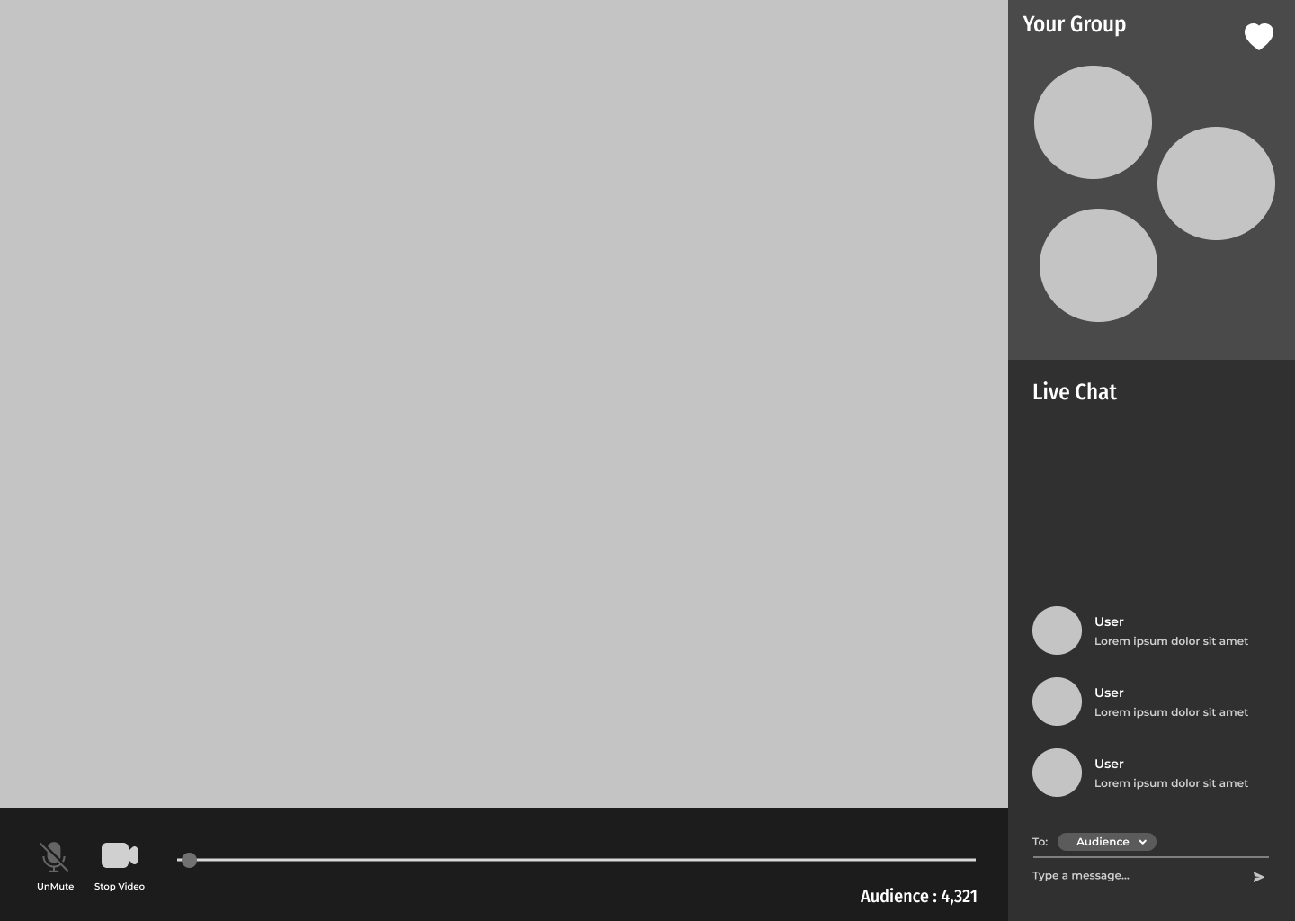
Below are selected examples from the mid-fidelity stage
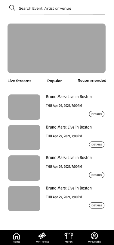
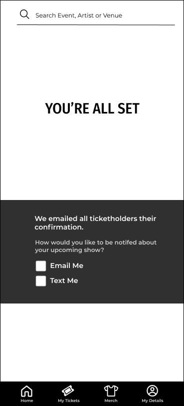
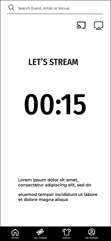
Bringing it Together
Before starting our hi-fidelity prototype, we researched other sites to find examples of the colors associated with our competitors and others. Our visual designer put together a comprehensive design system. Our primary researcher took on UX writing, and I concentrated on animations to guide the user through the mobile experience and into the streaming one.
Mood Board
Design System
Animations
I'm very interested in Interactive Design. I create animations that are beautiful but also purposeful (and even more beautiful as a result). You can learn more about my passion for this topic on my Interaction Design page.
Countdown for transition to streaming experience
[ no audio ]
Viewer's videos are shifted, but remain part of the experience
[ no audio ]
Hi Fidelity Prototype and Testing
Our researcher did usability testing with three users. All said the experiences the found the app straightforward and easy to navigate. But it wasn't without its bumps.
Prototype
trick template
Numbers 1, and 2
The central theme for this was supposed to be the virtual pre-show room. Our early usability feedback indicated that they didn't really know what that was. And asked for a description, prior to checking the checkbox.
A thought that I have since had is that we do not properly advertise that this is a free feature. The free feature will be in next steps because it should be prominently displayed.
Below is the full set of animation frames for our prototype. They really demonstrate the importance of components, for sure.