Introduction
Salt Lake Kicks is an independent online retail store reselling high end sneakers. The site was started in 2017 and is in need of a redesign. The design and navigation of the store was challenging, and then there was the nature of the inventory. These high-end sneakers were generally available in a quantity of one, which also means in only one size. This presents a unique challenge to customers like those in my user interviews, who are easily frustrated when a size is not in stock.
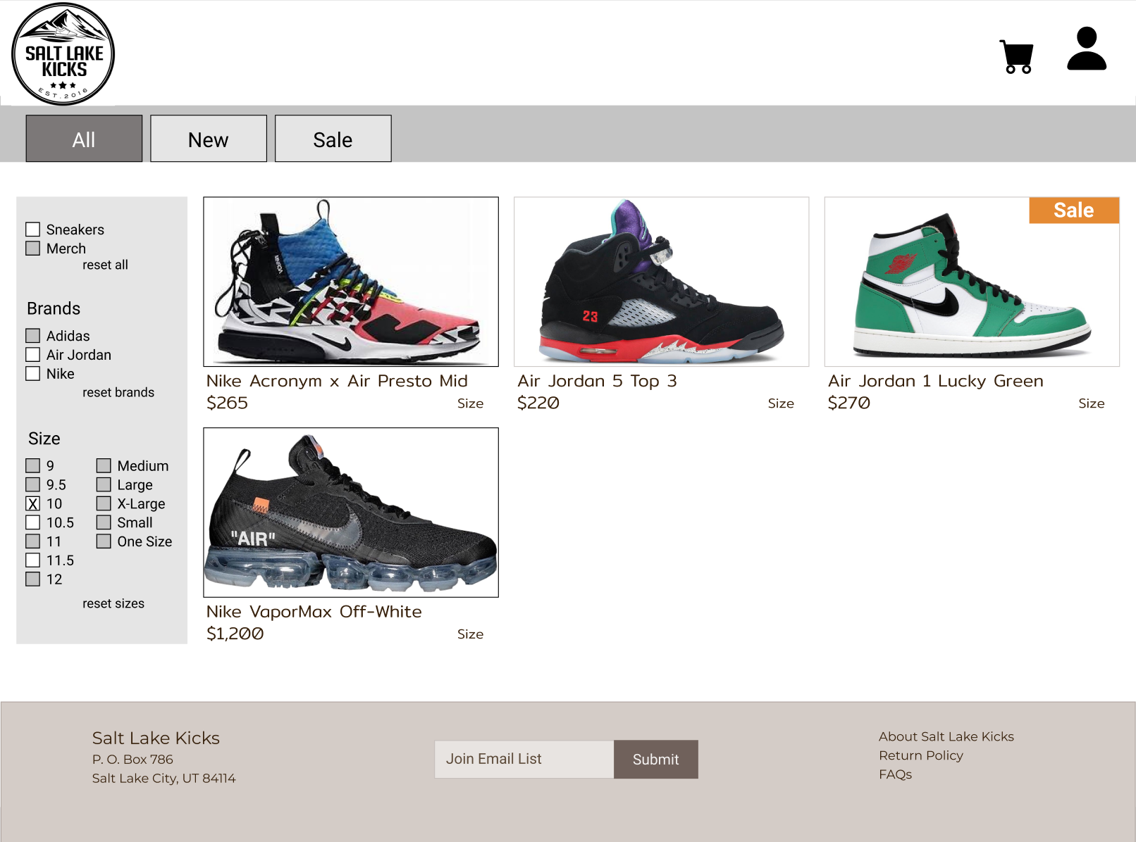
The task? Redesign the Salt Lake Kicks e-commerce website to create a user experience that allows a customer to easily scan the inventory for the styles they like, and filter for size to make the process more efficient and enjoyable.
Tools
Figma, Photoshop, Prior XD experience
Takeaways
Sometimes the biggest battle is not knowing what we don't know, proving the necessity for open conversation and teamwork for success in the UX design process. This was an online store with a tiny inventory—in my eyes (and experience) it was a failing enterprise. I wondered out loud, "Why do they even exist?" A fellow cohort member stepped up and explained SLK is part of an industry—actually, an entire retail concept—with which I had zero experience. High end resales are a different beast, as much as I researched, I would have been researching in the wrong direction without his help!!
Sketches
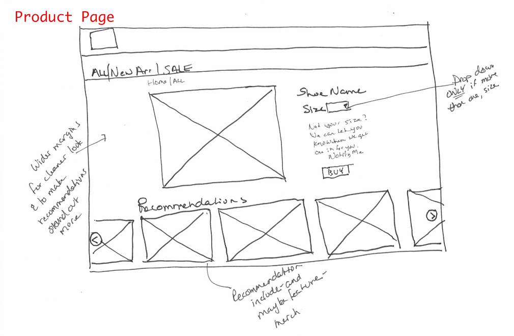
Things change and change and change, and that’s a good thing! There was a clear thread of data-driven changes in the iterations of the Product page, which I have chosen as a thread to highlight the evolution of the design through the design and delivery phases.
Three of the project brief requirements involved the Product Description page:
1. An Add to Cart function
2. Recommendations for other products
3. Product reviews.
You might notice once of these is missing in this sketch... and several that follow. No worries, eventually it finds its way in.
That said, some other details I captured were a conditional size dropbox (on the rare instances there was more than one size), and leveraging white space to help the product really stand out.
I went back and forth between Top nav / hero v1 and hero v2. I had a similar decision battle with the options in Add to Cart—Which button should be primary? View Bag? or Keep Shopping? The internet simply would not yield a consistent answer. I decided to revisit it in usability testing.
Wireframes (Mid Fidelity)
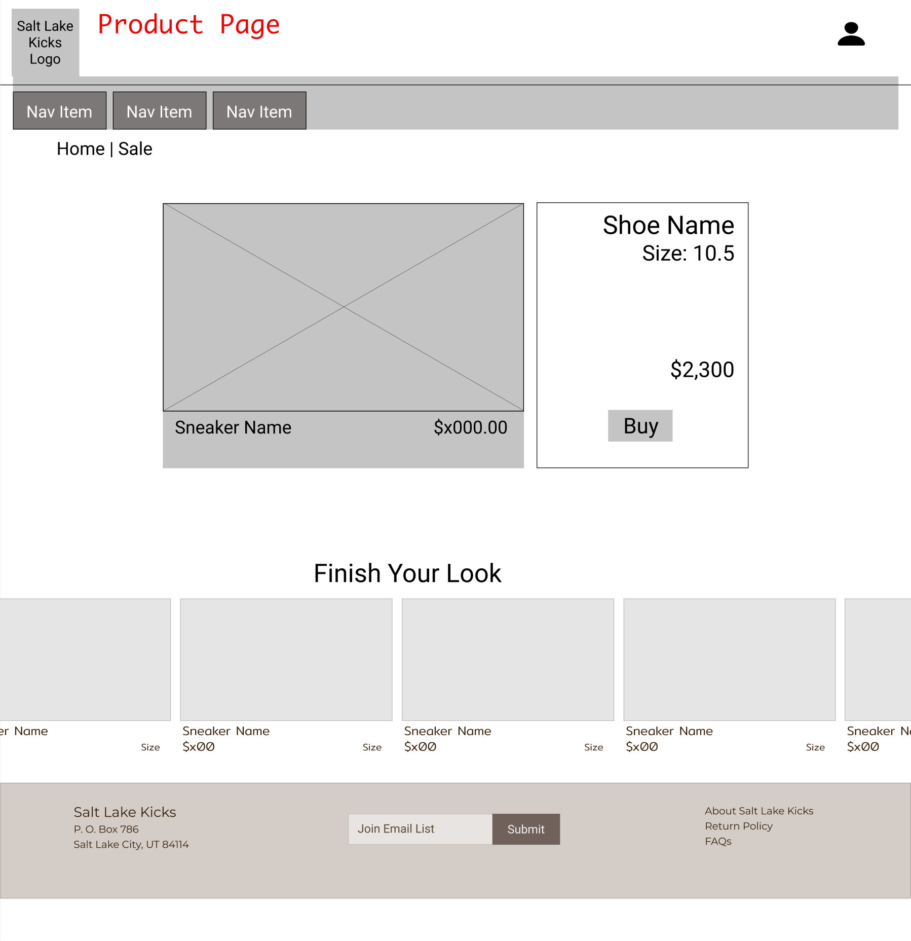
The Mid Fi wireframes were done after I firmed up my userflow and site map. The wireframes made my sketches real, bringing realities about formatting and flow, and an opportunity to pause, reflect, and check the specs. (Ahem.)
The mid-fidelity wireframes for the Product page showed both the recommendations, and the purchase button to trigger the add to cart workflow. That brings us to two for three. In the big white space of the product detail belonged the customer review flow!
This stage was also the beginning of picking up Figma. I’ve used Sketch and Adobe XD in the past, so I’m familiar with components. This was largely an exercise in changing up keyboard shortcuts, and getting a handle on the “frame” concept. (Which for the record, is awesome. Adobe XD don’t be jealous, we’ll always have states…)
In my early sketches I had two versions of a top navigation and hero image(s). During the wireframe stage I made the decision to go with Top nav / hero v.2 from my sketches. There was room for banners saying Sale! and Just In!, magic words to my interviewees. It also had a kind of "short cut" navigation system. Excellent choice. I probably should have stuck with it. I did, for a little while....
Mid Fidelity Prototype
I dressed up my wireframes, added a missing piece (mostly) and did my first ever usability testing. It was challenging, and the results were eye-opening. Users were eager to explore all the avenues of the app, but the prototype was only of the happy path. It was sometimes difficult to bring them back to the task at hand. Even more challenging? They refused to read my mind. Meanies.
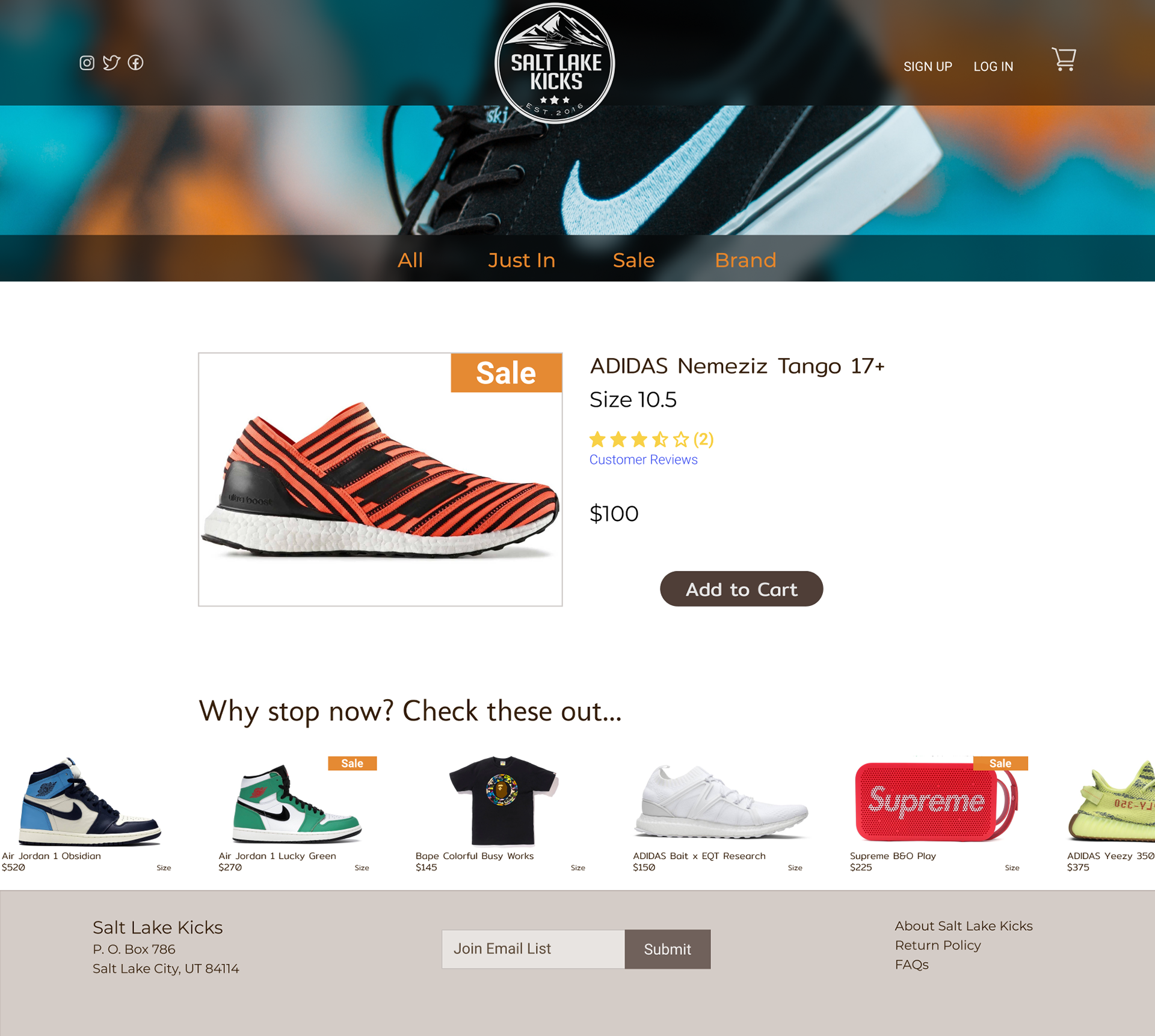
Here we are, back with our Product page. Now complete with requisite recommendations (that scroll!), an Add to Cart flow and, what was that other one? I forget. Nice stars though.
My users were able to complete two tasks, purchase a pair of size 10 shoes, and sign up for the email list no problems. The usability results for the third task, submit a customer review, failed consistently. Stars represent reviews… but not to my users. It required a simple fix, but for a feature I almost missed entirely, making sure it was actually usable was kind of important.
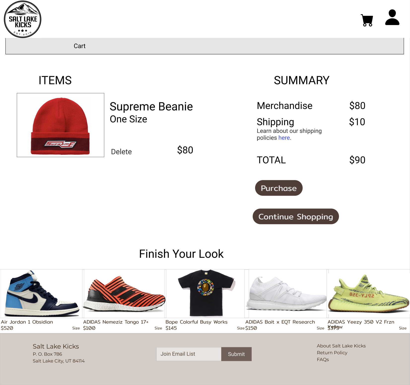
Also of note,
High Fidelity Prototype
I had excellent feedback from my usability testing, except for one small thing. Well, big thing, that was fixed with a little thing.
My users were unable to find the Product Reviews. I watched their cursors drift across the page, one asked "It is after I click add to cart?" I was puzzled and hinted, "What if I told you it was related to the stars." With that level of direction they could find it, signaling that more detail was needed.
Sometimes its the tiniest fixes that make all the difference. The starts were attractive but not carrying the message. The simple addition of the words "Customer Reviews" solved the problem neatly and users navigated to the review form without issue. The irony that my final stumbling block was the criteria I'd missed entirely in the beginning is not lost on me. The lesson? Don't quit until its fixed. Oh, and, always go back and review the spec!
Iterations
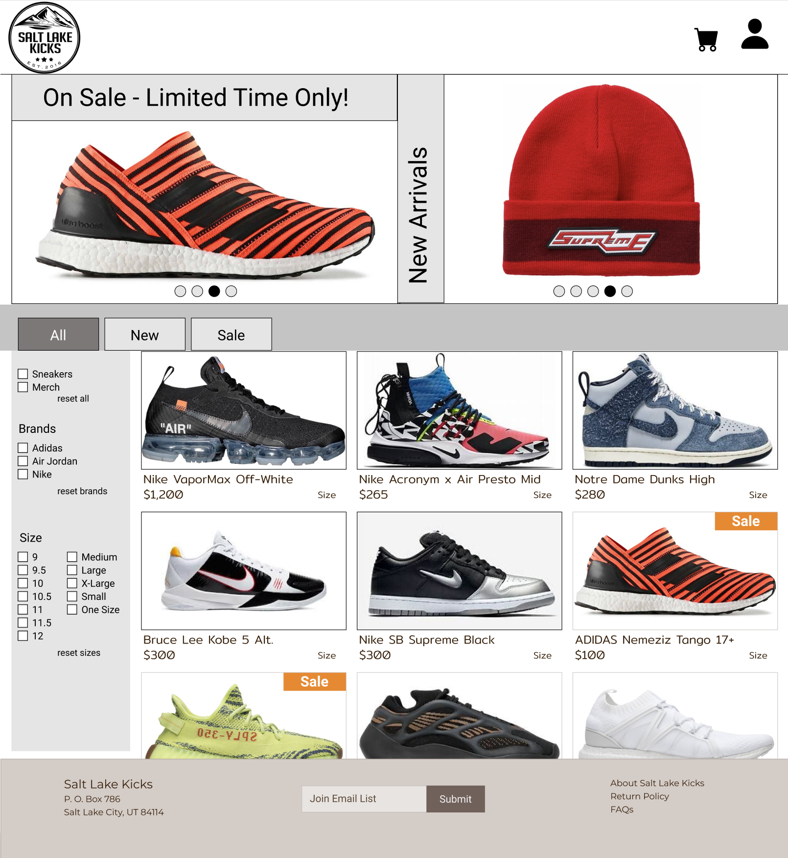
Best captured here (for the moment):
